This stackoverflow post was where I found how the outliers and whiskers of the Tukey box plots are defined in R and ggplot2:
In ggplot2, what do the end of the boxplot lines represent?
and this post on how to label the outliers using base graphics.
How to label all the outliers in a boxplot
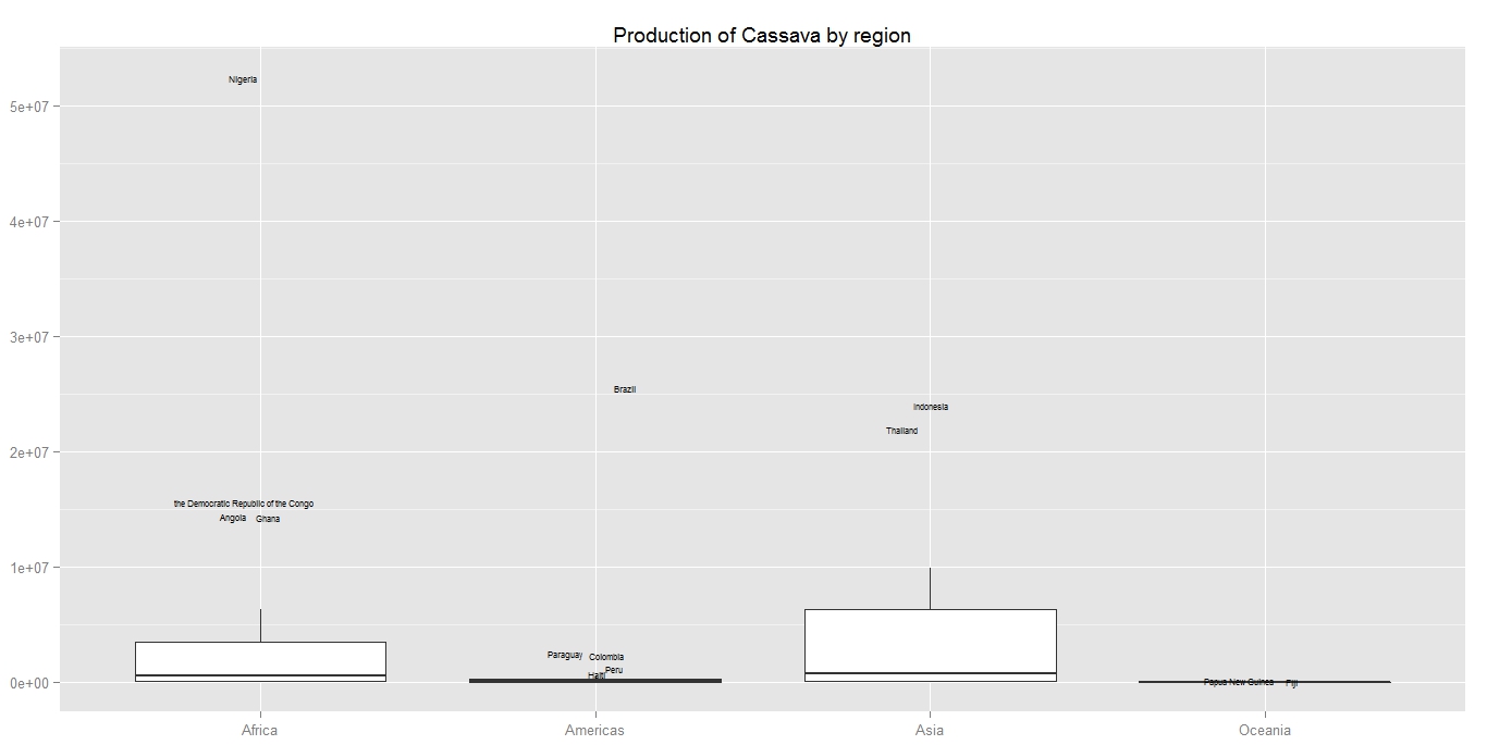
Since the use of ggplot2 is required for this task, I have written some basic hack code to label the outliers for ggplot2.
Here are the codes:
## Install the FAOSTAT package to obtain the data

if(!is.element("FAOSTAT", .packages()))
    install.packages("FAOSTAT")
library(FAOSTAT)


## Download data on Cassava production
cp.lst = getFAOtoSYB(name = "cassava_production", domainCode = "QC",
    itemCode = 125, elementCode = 5510)


## Use the country level data, and take only data for 2011 and remove the NA's
cp.df = cp.lst$entity[!is.na(cp.lst$entity$cassava_production) &
                      cp.lst$entity$Year == 2011, ]

## Merge with the country profile to obtain the country names for labelling
ccp.df = merge(cp.df, FAOcountryProfile[, c("FAOST_CODE", "ABBR_FAO_NAME")],
    all.x = TRUE)


## Merge with the regional pofile to obtain the UNSD M49 macro region
## composition for multiple boxplot.
rcp.df = merge(ccp.df, FAOregionProfile[, c("FAOST_CODE", "UNSD_MACRO_REG")],
    all.x = TRUE)


## Compute the quantile
qrcp.df = ddply(.data = rcp.df, .variables = .(UNSD_MACRO_REG), transform,
    lQntl = quantile(cassava_production, probs = 0.25, na.rm = TRUE),
    uQntl = quantile(cassava_production, probs = 0.75, na.rm = TRUE))


## Compute the lower and upper bound which defines the outlier
brcp.df = ddply(.data = qrcp.df, .variables = .(UNSD_MACRO_REG), transform,
    lBound = lQntl - 1.5 * (uQntl - lQntl),
    uBound = uQntl + 1.5 * (uQntl - lQntl))


## Remove the country names if it is within the bounds
with(brcp.df, {
    brcp.df[cassava_production <= uBound &
            cassava_production >= lBound, "ABBR_FAO_NAME"] <<- NA
})

## Plot the data
set.seed(587)
ggplot(data = brcp.df, aes(x = UNSD_MACRO_REG, y = cassava_production)) +
    geom_boxplot(outlier.colour = NA) +
    geom_text(aes(label = ABBR_FAO_NAME), size = 2,
              position = position_jitter(width = 0.1)) +
    labs(x = NULL, y = NULL, title = "Production of Cassava by region")